

WENG PIXIN’S ‘SWEET TIME’ ELEVATES THE ART IN COMICS ART
PopMatters | Chris Gavaler | June 24, 2020
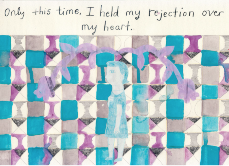
PopMatters | Chris Gavaler | June 24, 2020
Is it too early to announce my favorite comic of 2020? Obviously. So I’ll just say Weng Pixin‘s Sweet Time is one-hell-of-a contender.
Though the art of Sweet Time is by definition comics art, it stands impressively far above most of the conventions and genre expectations of the medium’s mainstream publishing history. In terms of form, Pixin is a comics artist—because she is composing sequences of juxtaposed images—but the visual impact of her artwork escapes the norms of most other graphic literature.
This is true despite her working with traditional panels and gutters. But how often does a comics artist carefully construct and layer strips of paper to form gutters that are as visually engaging as the content of the images they frame? How often does a comics artist focus attention on the qualities of her brushwork as her impressionist dabs widen into the thick swaths of an expressionist? How often is a comics viewer able to appreciate the texture of the paper absorbing the watercolors? It might be more accurate to simply call Pixin an artist, one who happens to be working in the comics form.
Categorizing Sweet Time is pleasantly difficult too. What do you term something that combines fiction and nonfiction—though maybe it doesn’t? Graphic memoirs are sometimes called graphic novels despite prose novels indicating fictional content. Whatever the nature of Pixin’s content, the work implies a collection, so even the more recent and inclusive term graphic narrative falls short.
The 15 subtitled subsections range from four- to thirty-pages, though most hover in the teens. Four are sequences of visual diaries organized by place: New York, Argentina, Lampung, Home. Other sections strike an autobiographical tone: a childhood crush, conversations with boyfriends, meeting a stranger in a bar, lots of mildly disturbing sex. The scene between an anthropomorphic frog and an anthropomorphic cat is obviously fantastical, though the flavor of its dream logic seems grounded in experience. But the young couple in the rowboat who float past a burning funeral pyre, is that a dream too?
The one wordless section, “Past Basement for Gold”, transcends the fiction/nonfiction dichotomy in the way any painting or sequence of paintings avoids such literary analysis. No one asks if an O’Keefe or a Rothko is autobiographical. While most of Pixin’s images are representational, sometimes the degree of abstraction is so high that the images begin to dissolve into pure form. That’s a rarity in traditional comics, and one of the many strengths of Pixin’s work.
In a way there’s little difference between the abstractions of fine arts painting (Picasso’s cubist distortions, for example) and the abstractions of comics cartooning. Both simplify and exaggerate. Pixin brings them even further together by employing an aggressively abstract style to repeating figures that, even though they appear in comic strips, resist the clichés of cartoons. Her blocky shapes and wonky perspectives are so rudimentary they can evoke children’s drawings at times, and yet their consistency and precision are equally striking.
I especially admire the full-page paintings in the longest sequence, “The Boat”, for capturing nuances of emotion through the figures’ facial expressions, while also emphasizing the formal effects of the brushstrokes that create them. Better still, the textures of the strokes on the page, while not directly representing anything in the story-world, evoke emotional qualities in themselves, doubling the overall impact of the images. That’s arguably what people mean when they distinguish something as “Art”. Form and substance combine to achieve something that transcends each individually.
Pixin makes the most of the comics form, while literally turning it sideways. Though Sweet Time is a standard size and shape for book publishing, its rectangular pages are wider than they are tall, and so the spine attaches at what would be the top edge of most other books. The internal panels run left-to-right, most often two to a page, but some of the collection’s best sequences compress a dozen panels across three rows, each image only slightly larger than a postage stamp.
Read the rest of the article at the link above.